|
|
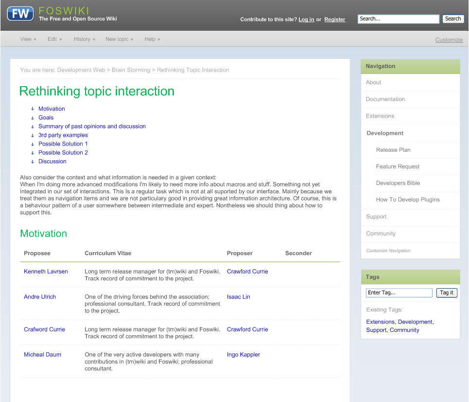
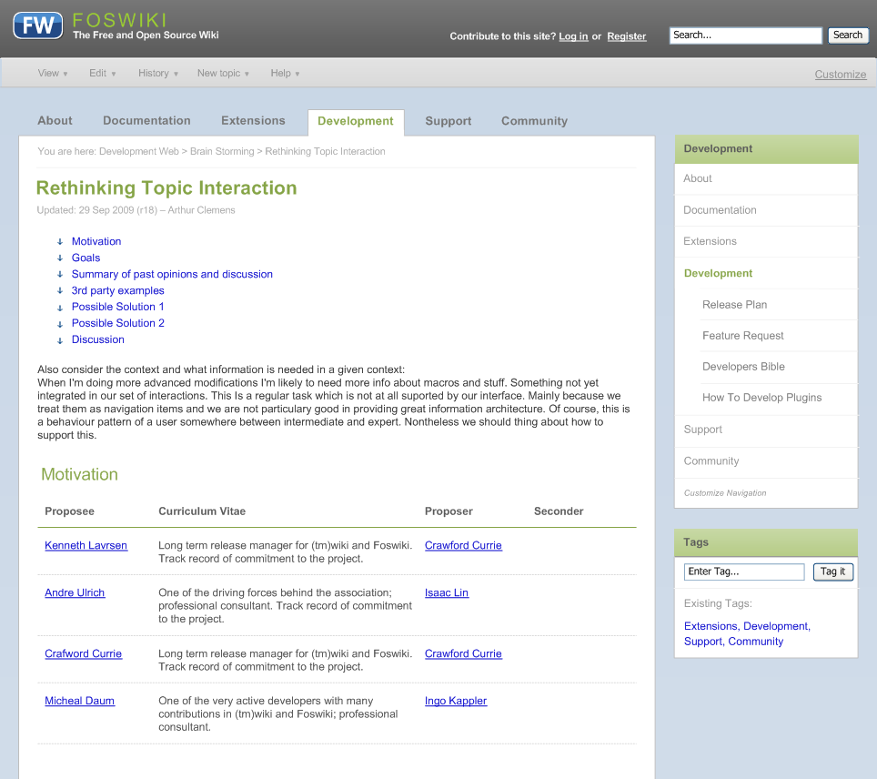
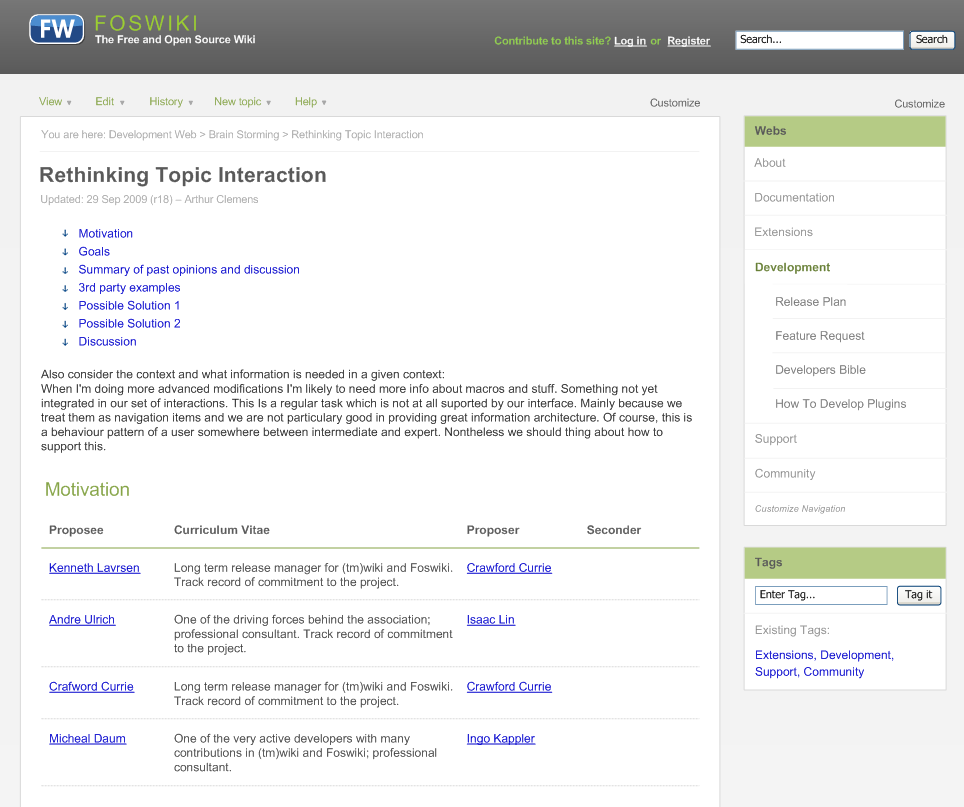
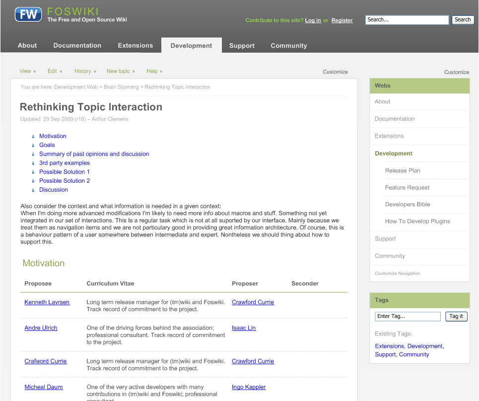
You are here: Foswiki>Development Web>BrainStorming>RethinkingTopicInteraction>WireframesViewScreen>DesignStudiesForNewSkin (12 Mar 2014, MichaelDaum)Edit Attach
Contents on this page are copied from WireframesViewScreen as they are more design studies than actual wireframes. Designs are just drafts by now.
DesignStudiesForNewSkin
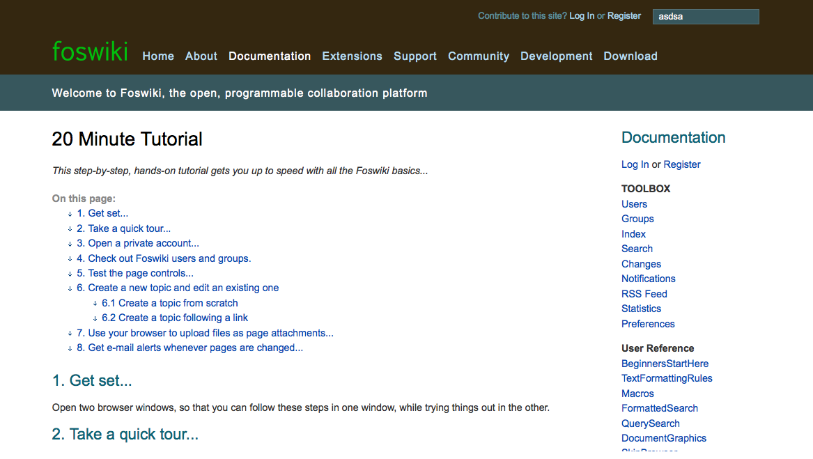
View Screen - Design Study 1
| View screen with side bar navigation only | View screen with horizontal navigation bar and additional side bar |
 click to enlarge |
 click to enlarge |
View Screen - Design Study 2
| View screen with side bar navigation only | View screen with horizontal navigation bar and additional side bar |
 click to enlarge |
 click to enlarge |
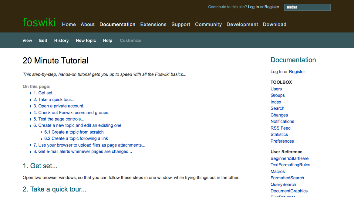
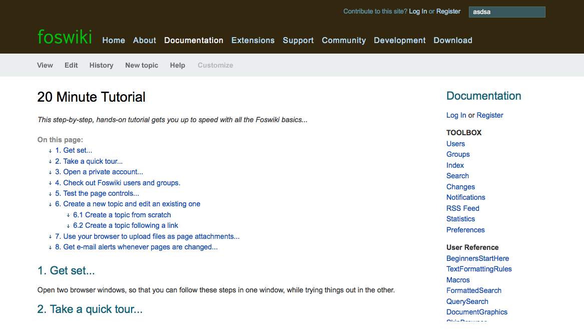
View screen with fold-out menus - Design Study 1
Each click on a button in the menu bar triggers a default action...- clicking "View" brings you back to the view screen if you are not there already (if you are on view already no default action is defined - we might need a way to indicate that?)
- clicking "Edit" opens the default editor
- clicking "History" loads the latest changes made to the topic
- clicking "New" opens the create new topic dialog
- clicking "Help" gives you a more advanced view of the contents inside the menu
View menu: 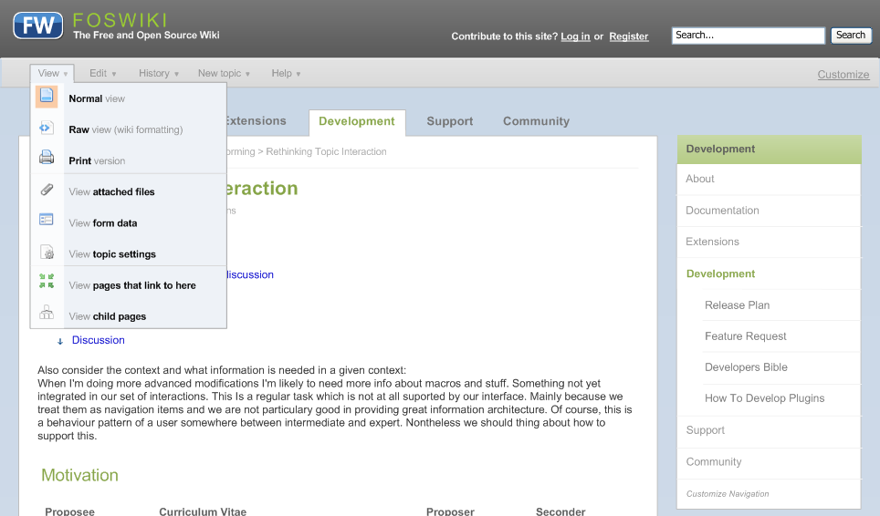 click to enlarge |
Edit menu: 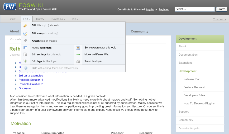 click to enlarge The edit menu might be too crowded. A possible fix would be to move the links/shortcuts for "edit tags" and "edit form data" to the view screen similar to our currendt "edit form" link above the form. |
History menu: 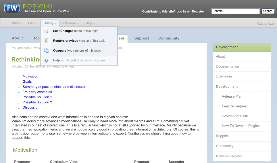 click to enlarge |
New menu: 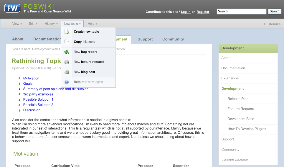 click to enlarge The idea with the "new" menu is to allow wiki apps to feed their "create new XY" links into the menu like shown with "create new bug report/feature request/blog post" |
Help menu: 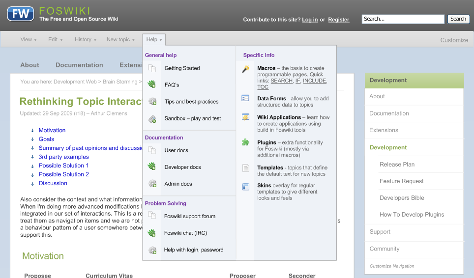 click to enlarge The help menu migth be too crowded as well. We need to check once we have the skin working if need to remove a couple of items. |
View screen with fold-out menus - Design Study 2
View menu: 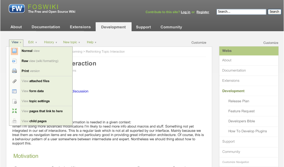 click to enlarge |
Edit menu: 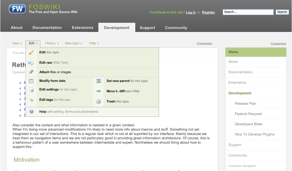 click to enlarge |
History menu: 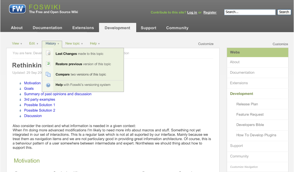 click to enlarge |
New menu: 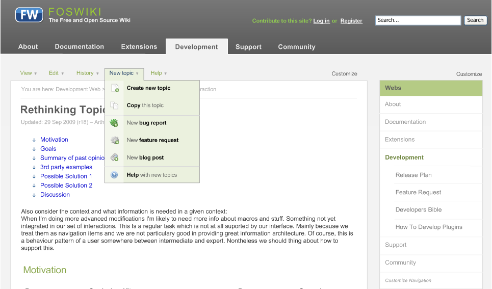 click to enlarge |
Help menu: 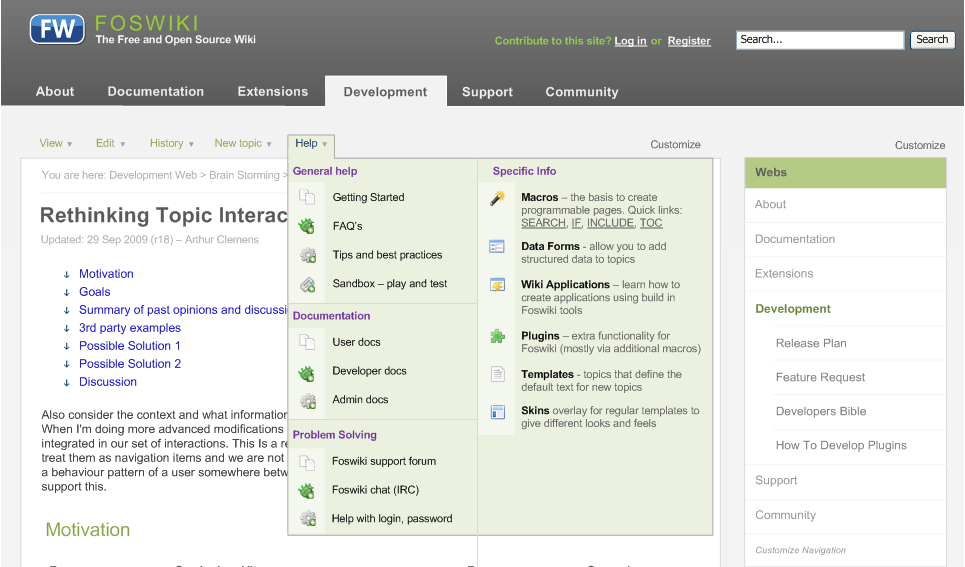 click to enlarge |
Design Study 3
Here's a new one based on the latest WireframesViewScreen.
click to enlarge
Design Study 4
Here's the latest:
click to enlarge
- It is not mocked-up anymore.
- It's a real prototype based on HTML+CSS+JS.
- The design works with the latest FF, Safari, Opera, Chrome, IE7 & IE8 (IE6 support needs some work though) on Windows XP.
- Design scales down to 800x600 without breaking the layout (screenshots below are at 1024x768)
click to enlarge
click to enlarge
click to enlarge
click to enlarge
Discussion
I love it. I am wondering how we will easily add new features to the wiki applications (new [topictype]) links, and also adding things like "Export to PDF..." next to your "print" button. And perhaps some sites would like to disable the IRC help link. I would really like to see recursive%TMPL:DEF%, as mentioned in ProcessAddToHeadAdds.
I also have some ideas (partially coded) where the breadcrumbs turn into an interactive/load-on-demand topic hierarchy browser, drag & drop re-parenting, but interactions there also tie into the sidebarto show sibling topics + siblings of parents around those.
Also when we get to coding this, if it doesn't complicate things too much it would be nice to think about how admins/plugins might easily add or override parts of the skin for Eg. tagging UI.
Regarding help docs: we need to sort out the taxonomy of the system web, which I hope to work on one day. To that end there is CleanUpTopicParentage, where MichaelDaum linked to a nice video inspiring me to improve my ajax topic browser solution.
Great work!
-- PaulHarvey - 08 Dec 2009
Hm, try exchanging positions for horiz navigation (About, Development, ...) with topic actions (View, Edit, ...)
-- MichaelDaum - 09 Dec 2009
when you do that you end up having two bars like outlined above or a different layout for both navigation patterns
-- CarloSchulz - 09 Dec 2009
In this design, it seemed more natural to have the topic actions right above the topic, just a feeling, ... maybe even making the topic action menu tab-ish with "View" being highlighted in view mode etc. At the same time the site navigation might be right under the top bar. It could also be placed above the header art but that's less common. Anyway, I simply had the feeling that those two menu elements kind of "crossed". Oh and I did not see the site navigation first time, i.e. I did not get the difference between the first two screenshots at first glance.
-- MichaelDaum - 09 Dec 2009
Somehow having the actions bar in between the header art and the horizontal navigation feels awkward. Not really part of the topic, not really meta. And of course we cannot enforce that the navigation is in the side bar. For the new site skin design I want pages without side bars...
So either the actions bar should be less a 'bar', less obtrusive, at the top of the topic. Or neutral at the top of the viewport. I would prefer this over an optimal Fitt's Law implementation.
We haven't investigated enough folding out interfaces. It may be that that gives us the cleanliness we need.
On the Help menu: it is too high. We can use a 3 column layout for this panel.
-- ArthurClemens - 09 Dec 2009
Though I understand (and partly share) your concerns about above approach I'm missing the arguments. What kind of problems will a user face?
"And of course we cannot enforce that the navigation is in the side bar."
I do not understand this remark, no one is forced to have it there.... If you do not want to have a sidebar at all you can simply disable it
-- CarloSchulz - 10 Dec 2009
Right now the topic actions are closer to the rest of the top bar than to the topic area it is about to affect. In between is the site navigation. So users will have to kind of step over the first non-related element to click on the topic actions.
There are a lot of screen updates where the topic menu changes together with the content area while the horiz site navigation remains unchanged.
The horiz site navigation seems to be grouped best as part of the top bar more than being next to the content area in this case.
I don't quite understand Arthurs point about the sidebar either.
-- MichaelDaum - 10 Dec 2009
I was referring to screen 1, where the main menu is in the side bar. That is a solution to not have 2 horizontal bars, but of limited value as we cannot enforce that the main menu is in the side bar.
-- ArthurClemens - 10 Dec 2009
Still don't get the point, sorry  . If you do not want it in the sidebar, then take screen two and remove the sidebar. In addition, screen one is the very same solution we have with current pattern skin.
-- CarloSchulz - 10 Dec 2009
I cannot wait to try out some of these things when they become available. One very useful thing that we added to our installation was a "presentation mode" toggle, which essentially hides everything except the topic view (no sidebars, navigation bars, topic actions, forms, etc.). This comes in handy when someone is projecting a twiki page and using it to drive discussion at a meeting ... every bit of screen real estate helps in that situation.
-- PankajPant - 10 Dec 2009
Good input Pankaj, would fit perfectly in the view menu.
-- CarloSchulz - 10 Dec 2009
I've uploaded an alternative design which adresses Micheal's and Arthur's concerns.
-- CarloSchulz - 10 Dec 2009
Following the same thread, using the new site skin design...
This is an idea to use the screen estate for 2 things. This is the first state, after the page has been loaded. The "web info" row (white on dark blue) shows you a welcome text (homepage) or a "web description":
. If you do not want it in the sidebar, then take screen two and remove the sidebar. In addition, screen one is the very same solution we have with current pattern skin.
-- CarloSchulz - 10 Dec 2009
I cannot wait to try out some of these things when they become available. One very useful thing that we added to our installation was a "presentation mode" toggle, which essentially hides everything except the topic view (no sidebars, navigation bars, topic actions, forms, etc.). This comes in handy when someone is projecting a twiki page and using it to drive discussion at a meeting ... every bit of screen real estate helps in that situation.
-- PankajPant - 10 Dec 2009
Good input Pankaj, would fit perfectly in the view menu.
-- CarloSchulz - 10 Dec 2009
I've uploaded an alternative design which adresses Micheal's and Arthur's concerns.
-- CarloSchulz - 10 Dec 2009
Following the same thread, using the new site skin design...
This is an idea to use the screen estate for 2 things. This is the first state, after the page has been loaded. The "web info" row (white on dark blue) shows you a welcome text (homepage) or a "web description":
click to enlarge
click to enlarge
 Valuable remarks, thanks. Especially the "rhythm", which is imho the hardest part...
-- CarloSchulz - 11 Dec 2009
Here's a 40x18 grid that works out fine for a 12px font.
Toggle grid
-- MichaelDaum - 11 Dec 2009
While valuable input, my impression is that at this stage we are still talking about ways of interaction, not about visual design.
-- ArthurClemens - 11 Dec 2009
Our main problems are not the visual details at the moment. We are missing the other important screen states - we need to see the whole picture to put the concept of the view screen sketched above in context. So let's concentrate our efforts more on getting those other screens done then arguing about the right grid or how we move from 90% or 95% visual perfection to 100%.
-- CarloSchulz - 11 Dec 2009
Just for the records, the second option is the way the MoveableType panel is made.
-- RafaelAlvarez - 11 Dec 2009
Study 2 in the new site skin, now completely aligned with Carlo's setup by killing the web info row:
Valuable remarks, thanks. Especially the "rhythm", which is imho the hardest part...
-- CarloSchulz - 11 Dec 2009
Here's a 40x18 grid that works out fine for a 12px font.
Toggle grid
-- MichaelDaum - 11 Dec 2009
While valuable input, my impression is that at this stage we are still talking about ways of interaction, not about visual design.
-- ArthurClemens - 11 Dec 2009
Our main problems are not the visual details at the moment. We are missing the other important screen states - we need to see the whole picture to put the concept of the view screen sketched above in context. So let's concentrate our efforts more on getting those other screens done then arguing about the right grid or how we move from 90% or 95% visual perfection to 100%.
-- CarloSchulz - 11 Dec 2009
Just for the records, the second option is the way the MoveableType panel is made.
-- RafaelAlvarez - 11 Dec 2009
Study 2 in the new site skin, now completely aligned with Carlo's setup by killing the web info row:
click to enlarge
 -- MichaelDaum - 14 Dec 2009
Here is one with a few modifications on the existing proposals:
-- MichaelDaum - 14 Dec 2009
Here is one with a few modifications on the existing proposals:
 -- MichaelDaum - 14 Dec 2009
We've talked about this already - the lighter background for the topic actions works better than the dark blue. On interaction: I like the search bar in the toolbar.
But the main menu is too far to the right. Actually that mockup is very similar to http://wordpress.com
-- ArthurClemens - 14 Dec 2009
Socialtext got some other ideas as well:
-- MichaelDaum - 14 Dec 2009
We've talked about this already - the lighter background for the topic actions works better than the dark blue. On interaction: I like the search bar in the toolbar.
But the main menu is too far to the right. Actually that mockup is very similar to http://wordpress.com
-- ArthurClemens - 14 Dec 2009
Socialtext got some other ideas as well:
 Not that I like the overall design. But there are still some things to mention:
- There are two bold buttons for Edit and Comment while the rest of the menu is aligned to the right.
- Anything user related like name, settings but also help is grouped at the top
leftright. That way it does not interfere with topic-related stuff. - "New Page" is grouped together with other elements related to the workspace (web).
- The sidebar is not used for site navigation. Instead it shows tags and attachment lists, things that we tend to group at the footer of a page.
 Actions of different kind are spread all over the page. It scores very low on visual design. However, they too group user stuff top right and are splitting up
some topic actions in a right aligned menu that are used more infrequent. This does make some sense to give users a clear hint on what is most important (edit).
CenterStage has got a quite crowded interface as well mixing horiz and vertical tabs. One intersting thing that I have also seen in other products like OpenSpaces:
There's a concept of "My workspaces" to easily customize the webs shown in the horizontal site navigation.
-- MichaelDaum - 14 Dec 2009
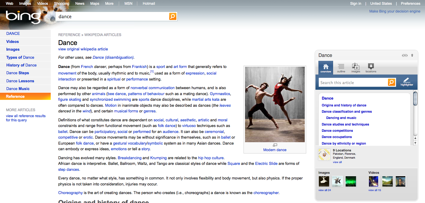
Regarding the side bar, Bing does a nice job with a multifunctional side bar, additional to the left filter menu:
Actions of different kind are spread all over the page. It scores very low on visual design. However, they too group user stuff top right and are splitting up
some topic actions in a right aligned menu that are used more infrequent. This does make some sense to give users a clear hint on what is most important (edit).
CenterStage has got a quite crowded interface as well mixing horiz and vertical tabs. One intersting thing that I have also seen in other products like OpenSpaces:
There's a concept of "My workspaces" to easily customize the webs shown in the horizontal site navigation.
-- MichaelDaum - 14 Dec 2009
Regarding the side bar, Bing does a nice job with a multifunctional side bar, additional to the left filter menu:
click to enlarge
click to enlarge
UserExperienceProjectForm edit
| TopicTitle | Design Studys for the new release skin |
| TopicSummary | |
| Subject | skin |
| Status | abandoned |
| Status note | no activity |
| Driver | |
| Skills needed | interaction design, visual design |
| InterestedParties |


Edit | Attach | Print version | History: r14 < r13 < r12 < r11 | Backlinks | View wiki text | Edit wiki text | More topic actions
Topic revision: r14 - 12 Mar 2014, MichaelDaum
The copyright of the content on this website is held by the contributing authors, except where stated elsewhere. See Copyright Statement.  Legal Imprint Privacy Policy
Legal Imprint Privacy Policy